
Reading the script on a print: simplified, traditional, Japanese and brush hands
Before you can read a print you need to know which writing system it uses. Here is how to tell them apart in a listing photo, where they trip people up, and why some brush styles stop even fluent readers.
Three writing systems sharing one rack
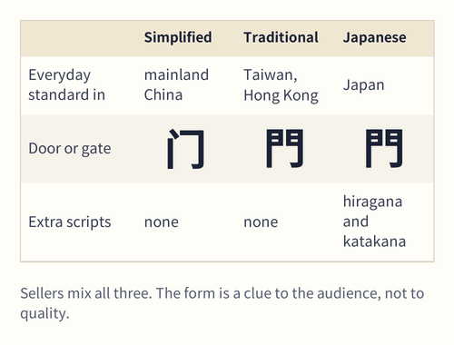
A rack of lettered tees from Chinese sellers can carry three different systems. Simplified characters are the everyday standard on the mainland. Traditional characters, with more strokes, are standard in Taiwan and Hong Kong and remain popular on clothing elsewhere because they look older and more formal. Japanese mixes kanji, its own forms of the characters, with two syllabic scripts, hiragana and katakana, which have no Chinese reading at all.
The dictionary behind most meanings on this site defines the two Chinese forms by stroke count: 繁體字 are the forms written with more strokes, 簡體字 the forms with strokes cut, as in 體 becoming 体 (the Ministry of Education dictionary (Taiwan), revised edition, “簡體字”).
For a shopper the practical point is that all three show up in one search, often from the same shop, because the people who draw these prints borrow whichever form gives the look they want.
Telling the forms apart in a listing photo
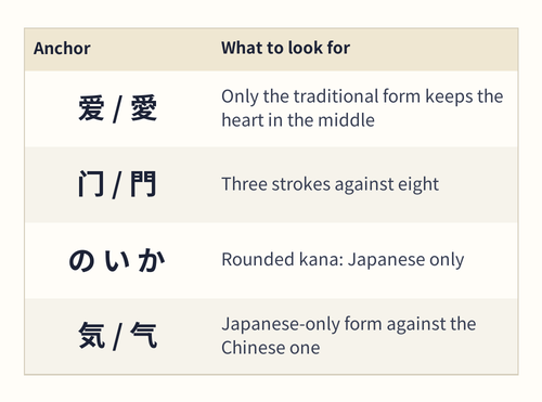
You do not need to read Chinese to sort a print into simplified or traditional; you need a few anchors. Look for characters you can compare against a known pair. 爱 and 愛 both mean love, but only the traditional form keeps 心 in its middle. 门 and 門, door or gate, differ at a glance: three strokes against eight.
Japanese gives itself away in two ways. Any rounded, simple-looking syllable such as の, い or か is kana, which Chinese does not use. And a handful of kanji have Japanese-only forms: 気 against Chinese 气 or 氣, and 桜, cherry blossom, against 樱 and 櫻 (Unicode Unihan record for 桜).
Zoom in on the seller’s photo rather than the catalog thumbnail; stroke detail disappears below a few hundred pixels, and the difference between two forms can be a single component.
One simplified character standing for two traditional ones
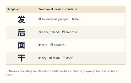
Simplification merged some characters. Going from traditional to simplified is safe; going the other way, which is what a seller does when a design “needs to look traditional”, forces a choice that software can get wrong.
- 发 stands for 發, to send out or prosper, and 髮, hair (Unihan). A New Year 发财 converted carelessly can come out as “hair wealth”.
- 后 stands for 後, after or behind, and 后, empress (Unihan).
- 面 stands for 面, face, and 麵, noodles (Unihan).
- 干 stands for 乾, dry, 幹, to do or trunk, and 干 itself (Unihan).
A wrong pick reads to a native speaker roughly the way “their” for “there” reads in English: understandable, and noticed at once.
Brush styles that native readers squint at
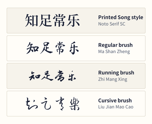
Typeface matters as much as script. Printed type such as the Song style is easy for anyone literate. Brush lettering ranges from regular script, 楷書 kǎishū, neat and upright, through running script, 行書 xíngshū, which the dictionary places between regular and cursive with a more fluid stroke, to cursive, 草書 cǎoshū, where strokes and even neighboring characters run together (the Ministry of Education dictionary (Taiwan), revised edition: 行書; 草書).
Cursive on a hoodie can look beautiful and stay unreadable to most of the people around you; many fluent readers need a moment, or a guess from context, to get through a line of it. Seal script, 篆書, the ancient style still carved on name seals, is further still from everyday reading (篆書).
If you want a print people can read, pick printed type or regular brush. If you want texture more than message, cursive is fine, and the reading card will tell you what it says.
Japanese kana inside Chinese-looking designs
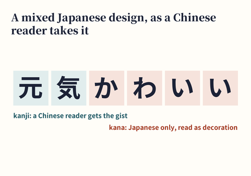
Designs aimed at a youthful, Japan-inflected look often drop kana into a layout that is otherwise in characters. かわいい kawaii, cute, written in hiragana, is a common example; the Japanese dictionary entry notes that its use has widened from small children to almost anything likeable (Digital Daijisen: 可愛い).
Characters shared by both languages can carry different meanings. 侍 is an attendant in Chinese and a samurai in Japanese; 忍 is a stoic “bear it” in Chinese and leans toward ninja in a Japanese-styled design (the Ministry of Education dictionary (Taiwan), revised edition: 侍; Daijisen: 侍).
A Chinese reader who has no Japanese will see the kana as Japanese decoration and read only the characters. Keep that in mind if you want the print to say something in particular.
What the script tells you before you order
Script is a quick read on who a design was made for. Simplified suggests the mainland market. Traditional suggests either a Taiwan or Hong Kong audience or a deliberately classic look. Kana means a Japanese mood, whatever the shop’s location.
None of these is a quality signal, and none is a problem. The checks worth doing are simple: is the form you see the form you wanted; are the characters complete and right way round; and does the seller’s own photo match the mock-up. The mock-ups page covers the last point in detail, and Glyph match has two- and three-form samples to hold up against your photo.
Images: catalogue photographs are category examples, not this site’s purchases or verified Mulebuy orders. Drawn material, dimension and lettering examples explain a concept; they do not certify the depicted product.