
Seller mock-ups, mirror images, turned characters and vertical lines
Many listing photos are not photos of the garment. Here is how to spot a mock-up, how a mirrored character gives itself away, which odd orientations are deliberate, and which Chinese text on a photo is not on the clothing at all.
Mock-up or a photo of the real garment
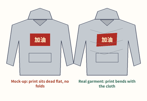
A mock-up is artwork pasted onto a stock photo of a blank garment. They are quick to make, so many shops list a design before printing a single piece. The tells are consistent: identical folds across every color, a print that sits perfectly flat over creases, no texture of ink on cloth, and the same lighting on garments that supposedly came from different dye lots.
Mock-ups are not dishonest in themselves. The risk is narrower: the print on the delivered piece can differ in size, position or color, and a mock-up can be flipped. A photo of the real garment, lying flat, settles all three.
When a listing has only mock-ups, ask for one flat photo of the front. Our picking notes give the request in Chinese and English.
How a flipped character gives itself away
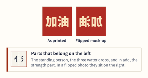
Many characters are built from a narrow component on the left and a wider one on the right, and the narrow ones are standard parts. 加, to add, has 力, strength, on its left. 你, you, starts with the standing-person component 亻. 油, oil, starts with the three-drop water component 氵.
In a mirrored mock-up those parts land on the right. To a reader the result looks plainly wrong, the way a reversed R does in English. If you do not read Chinese, look for the water drops and the standing person: they belong on the left edge of a character.
A flipped mock-up usually means the photo was reversed, not the garment. The flat photo of the real piece will tell you which.
Upside down on purpose: fortune has arrived
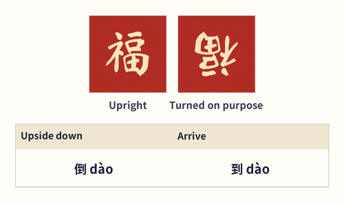
One character is often shown upside down deliberately. 福, good fortune, turned over makes a pun: 倒 dào, upside down, sounds the same as 到 dào, to arrive (the Ministry of Education dictionary (Taiwan), revised edition: 倒; entry for 到). So the turned character says that fortune has arrived.
Not everyone likes it. A folklorist quoted in a national news report in February 2018 argued that a turned 福 belongs only on rubbish bins and water buckets, where the pun is about pouring out, and that front doors should carry it upright (report, February 2018).
For clothing, an upside-down 福 is a playful nod most readers will enjoy. Any other upside-down character is probably a mistake.
Vertical lines and which way to read them
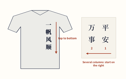
Chinese can run vertically. Traditionally a vertical column is read from top to bottom, and when there are several columns they are read from right to left. On clothing you usually meet a single column: down a sleeve, down the back of a hoodie, or beside a picture on a tee.
Vertical lettering is easy to misjudge in a photo. A sleeve print can be cut off by a fold, and a column down a hood can hide behind it. If the phrase is four characters, all four should be visible somewhere in the seller’s photos. English words set vertically are usually turned on their side, which is fine; Chinese characters in a column stay upright.
The Vertical switch in Glyph match redraws the multi-character samples as columns, so you can compare a sleeve print with the right shape.
Strokes that never add up to a real character
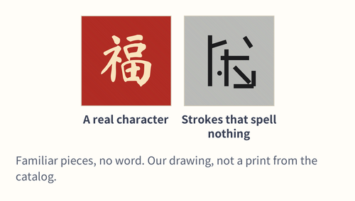
Some designs use writing-shaped decoration: strokes and parts arranged to look Chinese without spelling anything. A reader recognizes the pieces, a dot here, a hook there, and then finds no word in them. The usual reaction is a shrug, sometimes a smile.
This is hard to judge from outside, because a rare real character can look just as strange. The practical test: if the listing title calls the print “Chinese characters” but neither the seller nor a dictionary can tell you what it says, treat it as pattern, not text.
Glyph match includes one such sample, drawn by us from loose strokes, so you can see what a near-miss looks like.
Watermarks and captions that are not on the garment
A lot of the Chinese text in catalog photos is not on the clothing. Shops stamp their name across a picture to stop copying; the gray hoodie on our home page carries a shop name repeated several times over the photo, while the garment itself has a short English line.
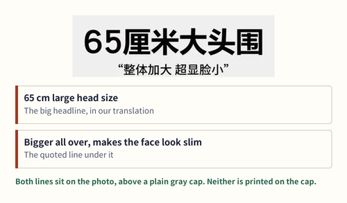
Other photos carry a sales caption. One plain gray cap in the catalog sits under a large line that reads, in our translation, “65 cm large head size”, with a smaller line promising a bigger fit overall that makes the face look slim. That is advertising, set on the picture.
Watermarks tend to repeat, sit at an angle or float over the background. Captions sit above or below the product in large type. Neither will arrive on your hoodie.
Images: catalogue photographs are category examples, not this site’s purchases or verified Mulebuy orders. Drawn material, dimension and lettering examples explain a concept; they do not certify the depicted product.